DAIRYLAND
HULLER
** Creative direction/ messaging handled by creative directior; All visual art direction, inspo, and graphics created by me**
PURPOSE:
Dairyland wanted to come off to their audience as the destination. This campaign marked the beginning of a new harvest season. They aimed to send the message of warmth, familiarity, and a place where your crops are handled with care.
MY SOLUTION:
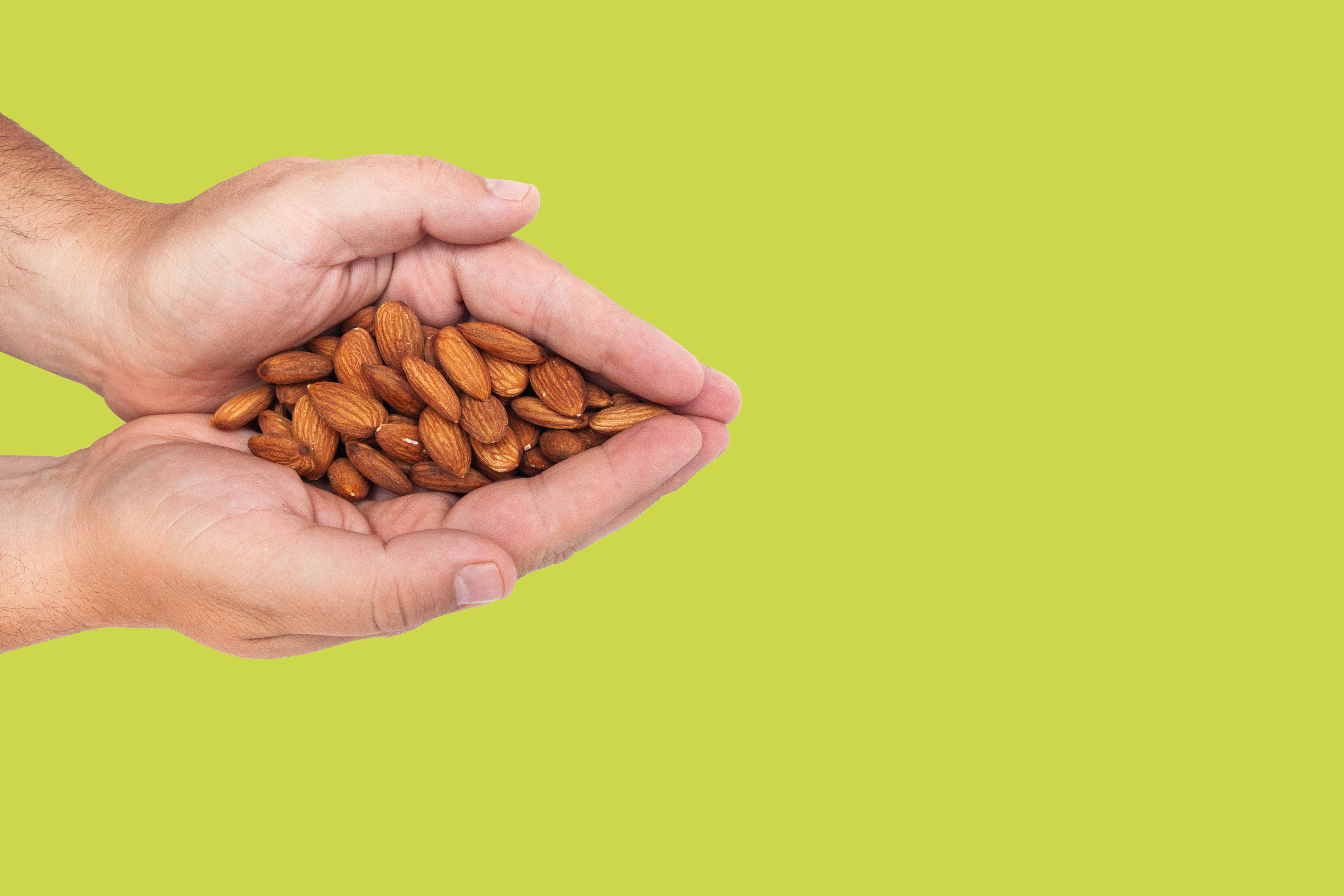
A gradient of the brand’s greens, paired with burnt oranges and warm tans inspired by their almonds, creates a friendly, early-morning feel that reflects the warmth Dairyland Huller wanted to convey. Close-up photography and a handwritten typeface add a personal, approachable touch, while white dashed lines guide the viewer’s eye to their name on the logo, reinforcing Dairyland Huller as the destination.

HOME
MY WORK
CONTACT
HOME
MY WORK
CONTACT
DAIRYLAND
Huller
DAIRYLAND
Huller
HULLER
Huller
HULLER
Huller
** Creative direction/ messaging handled by creative directior; All visual art direction, inspo, and graphics created by me**
PURPOSE:
Dairyland wanted to come off to their audience as the destination. This campaign marked the beginning of a new harvest season. They aimed to send the message of warmth, familiarity, and a place where your crops are handled with care.
MY SOLUTION:
A gradient of the brand’s greens, paired with burnt oranges and warm tans inspired by their almonds, creates a friendly, early-morning feel that reflects the warmth Dairyland Huller wanted to convey. Close-up photography and a handwritten typeface add a personal, approachable touch, while white dashed lines guide the viewer’s eye to their name on the logo, reinforcing Dairyland Huller as the destination.